BMW, short for Bayerische Motoren Werke (Bavarian Motor Works), stands as one of the top three luxury car manufacturers, alongside its compatriots Mercedes-Benz and Audi. Much like its rivals, the BMW logo meaning is among the most-recognized car emblems in the world and has several theories about its history.
Table of Contents
BMW AG Information
| Founded | 7 March 1916 |
| Founder | Franz Josef Popp Karl Rapp |
| Headquarters | Munich, Bavaria, Germany |
| Other brands | Rolls-Royce BMW M Mini |
| Official website | www.bmw.com |
| Slogan | Sheer Driving Pleasure (Worldwide) The Ultimate Driving Machine (United States, United Kingdom, Australia) The Ultimate Driving Experience (Canada) |
The BMW logo is a simple yet distinctive representation that combines three colors: blue, black, and white. It features a thick black circle, outlined in silver, with the company’s name placed at the top of the circle. Inside the circle, there are four quadrants created by alternating blue and white colors.
BMW Logo PNG
1920×1080
Two distinct interpretations of the BMW logo meaning exist, both appearing equally plausible. The first interpretation suggests that the blue and white quadrants directly reference the national colors of Bavaria, where the carmaker originated. This connection is not surprising, as it was a common practice during the era when BMW was established to maintain a link with the city or state of one’s birth, similar to other automakers like Maserati and Ferrari.

BMW Logo Meaning: The aircraft propeller theory
The other interpretation suggests that the BMW logo draws inspiration from the company’s history as an aircraft propeller manufacturer. According to this theory, the sky blue and white fields in the logo represent a white or silver rotating aircraft propeller set against a clear blue sky in the background. This interpretation reflects the company’s aviation heritage and its transition into the automotive industry.
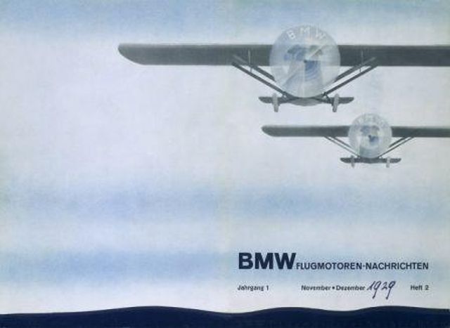
The BMW logo, created in 1917, initially saw limited use in contemporary marketing. However, in 1929, a significant development occurred when an advertisement featured an aircraft with the BMW Roundel logo, complete with rotating propellers. This advertising approach coincided with BMW’s acquisition of the license to manufacture Pratt & Whitney radial aircraft engines. The purpose of the advertisement was to highlight the company’s expertise in this field, underscoring its capabilities in aircraft engine manufacturing.
Undoubtedly, these events contributed to the legend of BMW’s association with spinning propellers, and since it harmonized well with the automaker’s overall branding, BMW did not actively dispel this urban myth. However, an official post by Fred Jakobs, the Archive Director of BMW Group Classic, has sought to set the record straight on this matter.

Whether an ode to aircraft propellers or not, the BMW logo stands as one of the most distinguished and enduring automotive emblems. It utilizes powerful colors and boasts a strong visual identity that has remained largely unaltered over the years.

A significant development in BMW logo history occurred in March 2020 when the German company introduced a new minimalist and flat logo. This updated emblem adopts a streamlined and two-dimensional design, notably omitting the traditional black ring. Instead, the logo features a transparent circle that adjusts its color according to the background. Furthermore, the 3D shadows in Bavaria’s blue and white colors have been removed in this modern interpretation of the logo.

The transparent logo introduced by the automaker is intended to symbolize openness and clarity, emphasizing the brand’s shift from automotive to technology and connectivity. Importantly, this new communication logo is not meant to replace the existing one. Instead, it will be used exclusively for online and offline communication, as well as at international trade fairs and events.

