Alfa Romeo is renowned for producing luxurious yet sporty automobiles, even though it enjoys less recognition compared to its Italian counterparts, Ferrari and Lamborghini. With a history spanning over a century, the Alfa Romeo emblem unquestionably boasts a rich heritage. Simultaneously, the Alfa Romeo logo meaning is one of the most distinctive and attention-grabbing emblems in the automotive industry.
Table of Contents
Alfa Romeo Logo Automobile SpA Information
| Founded | 24 June 1910 |
| Founder | Nicola Romeo Ugo Stella Alexandre Darracq |
| Logo creator | Romano Cattaneo |
| Headquarters | Turin, Italy |
| Slogan | La meccanica delle emozioni (The mechanics of emotion) |
| Owner | Fiat Chrysler Automobiles (FCA) |
| Official website | www.alfaromeo.com |
Alfa Romeo’s history can be traced back to 1910 when it was founded as Anonima Lombarda Fabbrica Automobili (ALFA). In 1915, the company came under the leadership of Nicola Romeo and was later rebranded as Anonima Lombarda Fabbrica Automobili Romeo (Alfa Romeo). In addition to manufacturing automobiles, the company also produced military equipment for both the Italian and Allied forces.
Alfa Romeo Logo Meaning
The Alfa Romeo emblem is intricately tied to the company’s place of origin, the city of Milan. The Alfa Romeo logo comprises two concentric circles of varying sizes, which encompass two Milanese symbols. These symbols are a red cross on a white background, directly referencing the city, and the biscione, a heraldic emblem that portrays a crowned snake swallowing a man. The biscione was the coat of arms of the House of Visconti, signifying the ruling family of the city during the 14th century. Inside the innermost circle, you’ll find “Alfa Romeo” written in capital letters.
Read Also: 10 Alfa Romeo facts you probably didn’t Know
Alfa Romeo provides a slightly different interpretation of the biscione. In response to a query from Jalopnik, the brand explained that the snake in the logo is not devouring the human figure; instead, it signifies the human emerging from the snake, symbolizing a rebirth. Alfa Romeo’s clarification dispels unfounded assertions that the snake represents the swallowing of a Moor, a Muslim resident of the medieval Maghreb. Nevertheless, Alfa Romeo did suggest that the biscione was an emblem adopted after the founder of the Visconti family, Otone Visconti, won it in a victory over a Syrian knight. This hints at a potential Islamic connection to the logo.
Alfa Romeo Logo History
Shortly after the company’s establishment in 1910, there was a need for a logo, and this task was entrusted to the chief engineer, Giuseppe Merosi. One of Merosi’s associates, Romano Cattaneo, proposed the use of the biscione in the Alfa badge, back when the company was still known as ALFA and had not yet become Alfa Romeo.
Merosi made some additional contributions, finalizing the logo. These additions involved placing the names “ALFA” and “MILANO” in the upper and lower halves of the blue circles that enclosed the two city symbols. Moreover, decorative embellishments were added between these words. These embellishments were not purely for ornamental purposes but signified the knots of the Savoy dynasty, which governed the city during that era.
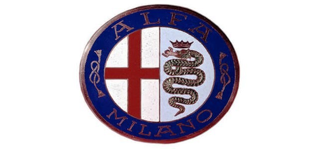
Over the years, the logo went through various alterations but preserved its overall visual identity, with these changes being quite subtle. One of the initial modifications involved switching the text color from brass to white. In 1915, when the company was rebranded as Alfa Romeo, this change was also reflected in the logo.
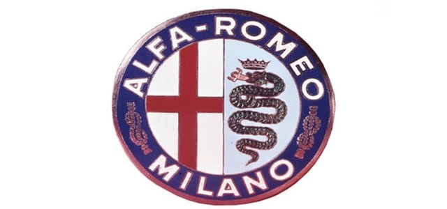
The most significant modification to the logo occurred in 1925 when a silver wreath was incorporated to celebrate the victory of the Alfa Romeo P2 in the first-ever Automobile World Championship. This championship was the equivalent of today’s Formula One, making the victory in its inaugural edition a remarkable achievement.
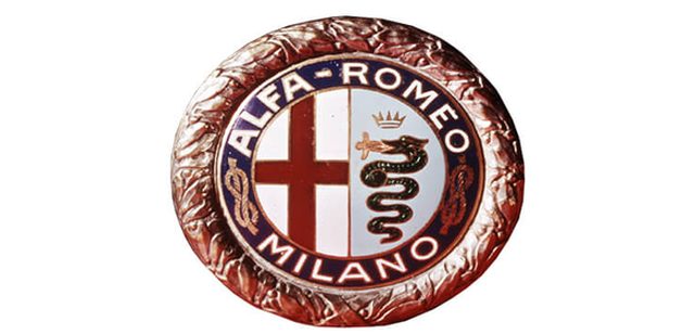
Another significant change took place in 1946 when Italy transitioned to a republic. In response, Alfa Romeo removed the Savoy dynasty knots from the logo and introduced a pair of wavy lines.
Alfa Romeo Logo Evolution
In the subsequent years, Alfa Romeo continued to streamline its logo, gradually eliminating several elements. This simplification process commenced with the removal of the decorative wavy lines in 1972. The logo also bid farewell to the “Milano” lettering following the establishment of its Naples plant. Furthermore, the scales, eyes, and gills of the serpent were also omitted from the logo.
In 1982, the wreath was eventually removed from the logo, and the colors were revamped. This redesign accompanied the simplification of the serpent symbol and the reconfiguration of “ALFA ROMEO” in the Futura typeface.
In 2015, a new logo was introduced, marking a change from the white and blue background colors of the previous symbols to a single silver textured background. The name “ALFA ROMEO” was also redesigned in a new typeface. This is the logo that can be seen on all new Alfa Romeo vehicles.
Read Also: Aldo Gucci, his design and the famous family feud

I thought the modern-day attempt at redefining the snake and man was a comical attempt at being politically correct. It’s not an image of rebirth. It’s an image of the Crusaders defeating Muslim invaders.
Ha ha ha. It is an image of stylized human sacrifice and divine origin of Visconti family 😉