Every brand possesses its own distinct and unique emblem, a fact that holds especially true in the realm of automotive brands, where logos assume a pivotal role. Among the most renowned, opulent, and stylish racing cars, the McLaren logo meaning needs no introduction to sports car lovers. Established in 1963, McLaren’s visual identity is built upon uncomplicated yet stylish principles, even if it encompasses a nuanced significance. The McLaren logo was conceived in 1981 and has been an enduring symbol for the company, undergoing modifications and enhancements throughout the years.
Table of Contents
McLaren Logo PNG
McLaren Information
| Founder | Bruce McLaren |
| Founded | 1963 |
| Products | Sports Cars |
| Official Site | www.mclaren.com |
| Logo Creator | Michael Turner Raymond Loewy |
McLaren Logo Meaning

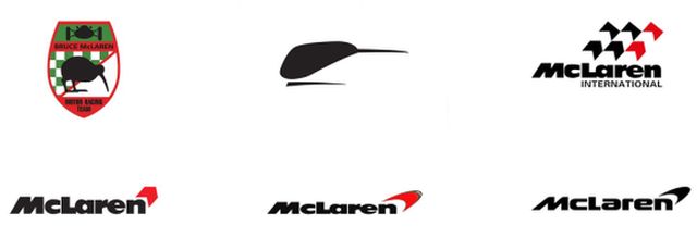
The McLaren logos have evolved, with the initial emblem dating back to 1963, coinciding with the early days of the business. Renowned artist Michael Turner was responsible for crafting a crest-like symbol, featuring a black outline of a kiwi bird set against a backdrop of green, red, and white hues. This choice of the kiwi as a symbol paid homage to the homeland of the company’s founder, Bruce McLaren.
The 1966 logo featured a stylized and abstract representation of a kiwi bird, showcasing a sleek and contemporary design. This emblem, affectionately known as the “Speedy Kiwi,” soon became an iconic symbol for the McLaren racing team. The black hue of the bird contrasted beautifully against both white and the brand’s distinctive orange background of that era, radiating a sense of optimism and expertise.
McLaren Logo Evolution

After a remarkable 14-year run, the “Speedy Kiwi” was eventually succeeded by the McLaren International logo. Designed by Raymond Loewy, this new emblem merged a bold black wordmark with a stylized tricolor checkered flag in black, red, and white. The inspiration behind the new McLaren logo was notably influenced by Phillip Morris, the maker of Marlboro, which was a prominent sponsor of the racing team. In this context, Loewy’s work was truly exceptional, as he managed to incorporate two logos into one, all while maintaining a strong connection to the world of racing. According to official accounts, the logo was commissioned by the tobacco company as a gift to McLaren.
In the following years, the numerous chevrons in the logo were streamlined, with just one prominent red chevron positioned above the last letter of the wordmark.
In 1998, another significant transformation occurred when the chevron was substituted with a red swoosh mark, leading to the creation of the McLaren Speed mark. This logo has been subject to various interpretations. One perspective suggests that the swoosh subtly reintroduces the kiwi silhouette in a stylized fashion. Another interpretation is that the swoosh represents an evolved version of the chevron. However, it’s improbable that the latter is the case, as Philip Morris shifted its sponsorship to Ferrari in 1997, necessitating McLaren to redesign its logo.

The official interpretation of the McLaren logo meaning is that the swoosh symbolizes the swirling vortices generated during car testing in a wind tunnel, a technical detail likely tailored to McLaren enthusiasts.
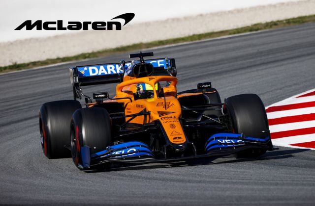
Then, there’s the introduction of the mono-black speed mark. This emblem signifies the unity of the various McLaren businesses, bringing them together as one cohesive group. However, this doesn’t signify a departure from its racing roots, as the company came full circle by reverting to its iconic ‘McLaren Orange’ racing livery.
In its most recent evolution, the speed mark has transitioned to a papaya hue, setting apart McLaren Racing. The logo now features a more streamlined and modernized font style that effectively conveys the agility and speed of the racing aspect. While the familiar McLaren logo remains intact, this refreshed identity ensures the brand is well-prepared for the digital age, future-proofing its image.
Despite the alterations made over the years, the core visual identity of the McLaren emblem has remained largely consistent. These changes, in a way, serve as a testament to the brand’s rich and evolving history in the world of automobiles.


