The Ford logo, also recognized as the Blue Oval logo, stands as one of the most familiar car brand symbols. Ford is one of the oldest and most valuable global brands. Situated in Dearborn, Michigan, Ford Motor Company is a U.S. multinational automaker founded in 1903, and credited with pioneering mass car production through assembly lines. Ford, alongside General Motors (GM) and Chrysler (now owned by Fiat Chrysler Automobiles), collectively known as Detroit’s ‘Big Three’ automakers. Currently, Ford is the second-largest American automaker and holds a place among the world’s top 10 automakers.
Table of Contents
Ford Motor Company Information | |
| Founded | 16 June 1903 |
| Founder | Henry Ford |
| Headquarters | Dearborn, Michigan, United States |
| Official website | www.ford.com |
| Other brands/JVs | Lincoln |
| Older brands | Mercury Jaguar Land Rover Aston Martin Volvo |
| Slogan | Go Further |
Ford Logo History – the Blue Oval, since 1927
Ford’s official emblem features its stylized brand name enclosed within a blue ellipse, a design that has been in active use since 1927. This emblem was crafted by Childe Harold Wills, one of the early associates of Henry Ford. Wills also played a pivotal part in creating the iconic Model T. Although the logo has undergone a few alterations and adjustments over time, it has consistently preserved its distinctive calligraphic style. Below, you’ll find a concise chronicle of the Ford logo and its progression over the past several decades.
The Original Nouveau Border Ford Logo
Before adopting the iconic blue oval, Ford explored various logo designs. The initial logo featured an ornate nouveau border with the inscription “Ford Motor Co. Detroit, -Mich.-.” As depicted in historical images, this original Ford logo was notably distinct from the one presently displayed on Ford vehicles. This emblem was in use from 1903 to 1907 when it was substituted by Childe Harold Wills’ signature “Ford” lettering.
Childe Harold Wills makes an entry
As mentioned earlier, the Blue Oval emblem only became widespread in 1927, replacing the Nouveau border logo that had been used until 1907. During the intervening years, Ford vehicles featured the emblem designed by Childe Harold Wills, which originally lacked an oval shape. Wills, who initially joined the company as a metallurgist and chief designer, was entrusted with the task of crafting a new brand identity. He used his father’s stencil set to create the iconic lettering, which has undergone only minor modifications since then. The “script with wings” design introduced elongated tails to the “F” and “D” letters.
Side note – Wills’ partnership with Henry Ford started in 1899 when he moonlighted at the latter’s first entrepreneurial attempt named Detroit Automobile Company. The company floundered but sealed the friendship between the two visionaries. Detroit Automobile Company was reorganized in 1901 as Henry Ford Company which saw the departure of Henry Ford in the subsequent year following a dispute between Ford and his investors. It is quite interesting that the Henry Ford Company was renamed to Cadillac Automobile Company!
Ford Logo PNG Vector
Introduction of Oval and the surge of the Blue Oval logo
While the official adoption of the Blue Oval logo by the company took place in 1927, it’s worth noting that Ford’s UK business began incorporating the oval and the blue background in its communications with buyers as early as 1907. Consequently, Ford’s emblem gained the nickname “Blue Oval” during this period. This emblem was employed to promote Ford as the “symbol of reliability and affordability.”
The Winged Pyramid Ford emblem that crumbled soon
Henry Ford was known for his attention to detail and he was unwilling to tamper with the brand’s elegant design identity crafted by Childe Harold Wills. However, a significant departure occurred in 1912 when the company began using Wills’ lettering with a blue-winged pyramid in the background, proclaiming Ford as “The Universal Car.” Nevertheless, it didn’t take long for Henry Ford to notice the inconsistency, and this Ford emblem was reverted to the previous design later that same year.
The official Blue Oval Logo
Ford formally adopted the Blue Oval logo in 1927, specifically on the 1927 Ford Model A. Since then, it has preserved its fundamental attributes, with only occasional minor alterations in its shape and colors.
The next significant change in Ford’s emblem occurred in 1957 when a new design was introduced, featuring a more angular oval shape. Unfortunately, the specific designer behind this change is not widely documented, making it challenging to attribute this design to a particular individual.

Despite the unconventional design, Ford continued to use it until 1976, and we’ll soon understand the reason behind this. In 1976, they introduced a flattened oval design, which featured a shift from white font to silver, and the addition of a silver edging. This new Ford emblem, a 3D logo, became significantly sleeker and is the closest predecessor to the one seen on Ford vehicles today.
Centennial Blue Oval
The next notable change occurred in 2003, a significant year as it marked Ford’s centennial. Appropriately, this emblem is referred to as the Centennial Blue Oval logo. While it might seem similar to the preceding design at first glance, a closer examination reveals that the silver edges had been replaced with white. Additionally, Ford introduced the Centennial Blue color as the background, making it a distinct variation.
Fun Fact – The logo that wasn’t to be
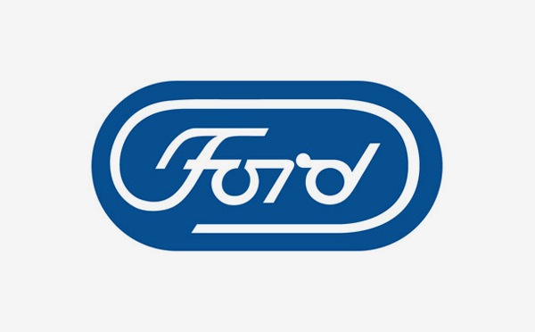
As previously mentioned, here’s a detailed explanation of why Ford persisted with the angular oval logo for an extended period. In 1966, Henry Ford II, who was Henry Ford’s grandson, decided to move away from the old design. He hired the renowned logo designer Paul Rand to develop a new brand identity for the company. This marked a significant turning point in Ford’s logo history and led to the subsequent changes in the emblem’s design.
Paul Rand was a highly respected figure in the 1960s when it came to graphic design and was known for creating logos for prominent companies like IBM, ABC, Westinghouse, Cummins, and UPS. When tasked with redesigning the Ford logo, he introduced a departure from the oval shape, replacing it with an elongated oval, often referred to as an “obround.” He also presented a more contemporary interpretation of the Ford lettering. However, after careful consideration, Henry Ford II ultimately decided that the new design was too radical and chose to stick with the traditional Blue Oval. In hindsight, this decision proved to be a wise one for the company.
Another fun fact – The Blue Oval Logo was mortgaged and reclaimed
In line with the challenges faced by the entire automotive industry, the renowned automaker experienced difficulties in 2006 and was operating at a loss for each car sold. The looming recession posed significant challenges that were unprecedented in scale. In contrast to General Motors (GM) and Chrysler, which opted for taxpayer-sponsored bailouts, Ford’s CEO at the time, Alan Mulally, took a bold approach. He leveraged all of the automaker’s assets to secure a substantial $23.5 billion loan, pursuing a different and audacious strategy to navigate the turbulent times.
Alan Mulally, with his track record of successfully turning around Boeing before joining Ford, had established a strong reputation as a turnaround expert. However, the decision to leverage Ford’s assets for the loan was indeed a risky move. If Ford had failed, the consequences could have been severe and far-reaching. Among the assets used as collateral for the loan were the iconic Blue Oval, as well as valuable trademarks like Mustang and F-150, the company’s headquarters in Dearborn, and its manufacturing facilities.
Alan Mulally cut costs, streamlined operations, and sold off luxury brands like Aston Martin, Volvo, Jaguar, and Land Rover. Ford avoided a government bailout and emerged from the crisis successfully.
In 2012, both Moody’s and Fitch upgraded Ford’s credit rating to investment grade. This allowed Ford to regain official ownership of the Blue Oval logo and the other assets that had been used as collateral for the loan, marking a significant milestone in the company’s financial recovery.

Content was super helpful and very delightful to read