Bentley Motors, a renowned British luxury automobile manufacturer, possesses a rich and extensive history that spans over a century. Among the distinctive and easily recognizable features of Bentley’s brand is its iconic emblem. In this article, we delve into the Bentley logo meaning, history, and evolution, tracing its origins and examining the intricate design elements that have solidified it as a lasting symbol of automotive excellence.
Table of Contents
Bentley Logo PNG
Bentley Motors Information
| Founded | 1919 |
| Founder | Horace Millner Bentley Walter Owen Bentley |
| Logo creator | Frederick Gordon-Crosby |
| Headquarters | Crewe, England |
| Official website | www.bentleymotors.com |
| Owner | Volkswagen Group |
Bentley Logo Meaning – The Birth of a Legacy
The origins of the Bentley car emblem trace back to 1919 when the company was founded by Walter Owen Bentley. Commonly known as Walter Owen, he first achieved prominence as a motorcycle and car racer before gaining renown for his proficiency in the design of aircraft and automobile engines.
Nonetheless, it was the artistic contributions of motoring artist and sculptor F. Gordon Crosby that brought the iconic Bentley logo to life. Intriguingly, F. Gordon Crosby is also recognized for his involvement in crafting the design of the Jaguar emblem.
Bentley Logo Meaning – The Birth of a Legacy
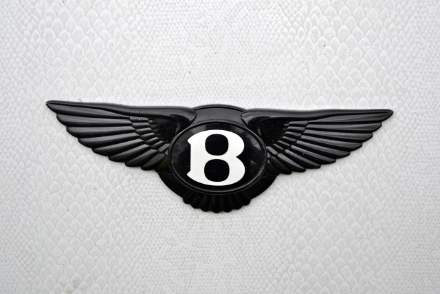
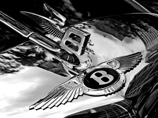
The initial rendition of the logo featured a simple and refined design, comprising stylized wings. These wings were symbolic of speed, freedom, and the brand’s unwavering commitment to crafting outstanding automobiles. At the heart of the emblem, the letter ‘B’ from Bentley was prominently showcased within a circular frame. This seamlessly integrated ‘B’ served as a symbol of Bentley’s dedication to luxury and distinction. Notably, the wings paid homage to Bentley’s earlier involvement in the aviation industry.

Bentley Symbol Evolution – Asymmetry at the Core
While the Bentley logo is commonly associated with concepts of speed, freedom, and the brand’s aviation legacy, it carries a subtle nuance. This detail might not immediately catch the eye of a casual observer, but the brand employed a clever strategy to distinguish its mass-market cars from those tailored for its more affluent clientele. In the case of ultra-premium or racing cars, the emblem showcased 11 feathers on the right side, while the left side featured only 10 hackles. This intentional asymmetry was not just a distinctive design choice but was also considered auspicious by both the brand’s proprietors and its discerning buyers.
Conversely, the overwhelming majority of Bentley’s more affordable cars featured a symmetrical emblem, showcasing 10 feathers on both sides.
Read Also: Armani Logo Meaning – 4 Things You Should Know
The Flying B Rolls In
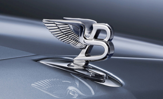
In a subsequent development, Bentley introduced a more intricate variant of the logo exclusively crafted for use as a hood ornament. This version featured a forward-leaning ‘B’ adorned with a pair of wings gracefully sweeping backward, giving rise to the iconic Flying B ornament, also designed by F. Gordon Crosby. However, safety concerns related to solid hood accessories led to its phase-out in the 1970s. Fortunately, the Flying B ornament made a triumphant return in 2006, this time in the form of a retractable ornament.

Transfer to Rolls-Royce
In 1931, Bentley faced financial challenges, leading to its acquisition by Rolls-Royce. Despite this change in ownership, the Bentley emblem continued to be in use but underwent a subtle modification. The wings of the Bentley insignia were adjusted to achieve symmetry, featuring 10 feathers on each side for all models, eliminating the distinctive asymmetry. However, this alteration was reversed in the 1990s, and the original design with intentional asymmetry was reinstated.
Simplification and Modernization
Throughout the decades since its creation, the Bentley logo has undergone various adaptations to stay in harmony with evolving design trends. Nevertheless, the fundamental design elements of the emblem, including the distinctive ‘B’ and the wings, have retained their authenticity. The latest iteration of the logo remains remarkably similar to the original, with only minor differences.
The Present-Day Emblem
In recent years, the Bentley logo has evolved into its current iteration, skillfully merging tradition with modernity. This updated emblem features a sleek, three-dimensional design that conveys a sense of depth and sophistication. While the iconic wings retain their classic form, they are now enhanced with intricate detailing, serving as a testament to Bentley’s unwavering commitment to precision craftsmanship.

Symbolism and Significance
The Bentley logo holds profound symbolism and significance. The wings stand as a symbol of speed, elegance, and the unwavering pursuit of excellence, visually encapsulating the brand’s remarkable legacy and the exhilarating driving experience offered by Bentley vehicles. Conversely, the circular shape signifies unity, continuity, and the brand’s enduring commitment to craftsmanship and innovation.
Bentley Car Logo = Timeless Appeal
A pivotal factor contributing to the enduring legacy of the Bentley logo is its timeless allure. The design encapsulates a feeling of opulence and sophistication that resonates with discerning car enthusiasts globally. Its versatility allows for seamless integration into a variety of marketing materials, ranging from car badges to advertising campaigns, fostering a consistent and powerful brand image.
The enduring classic status of the Bentley logo on cars is substantiated by the fact that more recent brands, like Genesis, have drawn inspiration from it. Additionally, it’s noteworthy that Hyundai recruited Luc Donckerwolke from Bentley for its Genesis brand.
In conclusion, the Bentley car logo stands as a testament to the brand’s unwavering dedication to excellence, craftsmanship, and innovation. The history and evolution of the Bentley logo over the past century have adeptly navigated changing design trends while preserving the essence of Bentley’s illustrious heritage. The emblem’s iconic wings and the elegant letter ‘B’ serve as symbols of the brand’s commitment to crafting luxurious, high-performance vehicles. With its enduring appeal and meticulous attention to detail, the Bentley logo continues to captivate the hearts of automotive enthusiasts worldwide.


