In recent times, Tesla has risen to prominence as a prominent name in the automotive industry. This is largely attributed to its remarkable collection of electric vehicles, which can be likened to consumer electronics devices due to their ability to receive updates ‘over the air.’ However, there is more to the Tesla logo meaning as we will see in this article. Continue reading to uncover the meaning behind the automaker’s name, which is derived from the renowned Serbian-American engineer and physicist, Nikola Tesla. It is widely assumed that the logo, a stylized T, represents both the scientist and the company’s name.
Table of Contents
Tesla Logo PNG
Tesla Inc Information
| Founded | 1 July 2003 |
| Founder | Martin Eberhard Marc Tarpenning Elon Musk J. B. Straubel Ian Wright |
| Headquarters | Palo Alto, California, US |
| Official website | www.tesla.com |
| Tesla Logo Designer | RO Studio |
Tesla Logo History: Is Elon Musk a founding member?
Elon Musk, the CEO of Tesla, is undeniably the company’s prominent figure, and it’s challenging to envision Tesla without his involvement. However, the company’s origins tell a different story. In 2003, when Martin Eberhard and Marc Tarpenning founded the company under the name Tesla Motors, Elon Musk was not yet in the picture. It was in 2004 that Musk initiated the initial round of funding and continued to invest in subsequent rounds. Only in 2008 did Musk officially join the company as a board member, eventually assuming the role of CEO. This transition was not without its difficulties, as it was marked by a contentious power struggle between Musk and Eberhard.
Eberhard went a step further by filing a lawsuit in which he contested Elon Musk’s status as a founder of Tesla. This legal dispute continued until an out-of-court settlement was reached in September 2009, which officially recognized Musk, along with JB Straubel and Ian Wright, as the founders of Tesla.
Tesla Logo Meaning: Is it Cat Nose?
Shortly after Musk’s investment in the company, he enlisted the services of RO Studio to create a logo for Tesla Motors. RO Studio, the same company that had previously crafted logos for Musk’s SpaceX, was entrusted with this task.
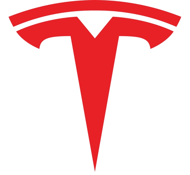
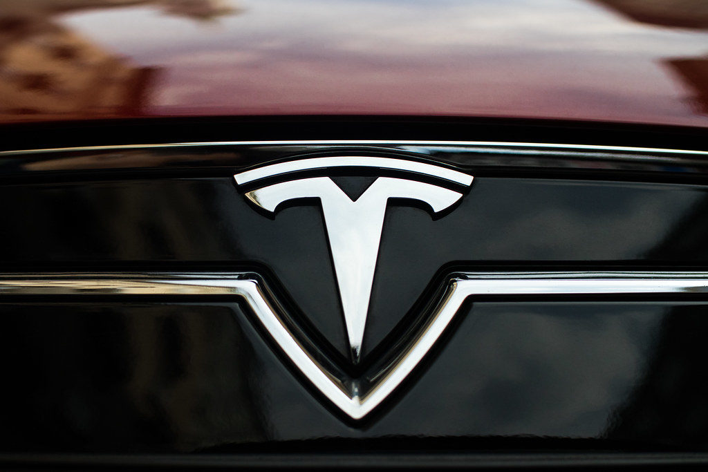
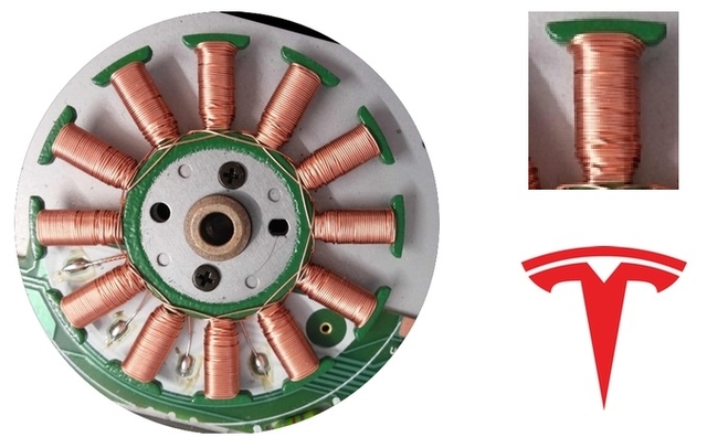
Given the fundamental role of electric motors in electric cars, RO Studio employed a concept similar to what it had executed for SpaceX. The design studio adopted a cross-sectional perspective of an electric motor’s pole to craft a straightforward yet impactful design element resembling the letter “T.” This design was further refined and stylized. Musk himself affirmed this version of the logo in a Twitter post.
Similar to SpaceX, the T is like a cross section of an electric motor, just as the X is like a rocket trajectory
— Elon Musk (@elonmusk) January 19, 2017
Unquestionably, the symbol harmonized seamlessly with the company’s overarching theme, effectively conveying its strong commitment to electric mobility. Additionally, the logo incorporates a curved section positioned atop the stylized “T,” symbolizing the air gap that exists between the motor’s rotor and stator.
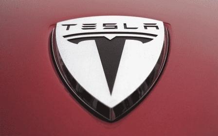
In the initial stages, the stylized “T” and the Tesla lettering were encased within a shield, similar to the emblems of Ferrari and Lamborghini. This shielded version was featured on all Roadsters. However, at a later point, the shield was discarded in favor of a significantly simplified version of the logo.
Although the significance of the Tesla logo might not be immediately evident, once you’re aware of the reference, it becomes unforgettable. The Tesla logo design incorporates the color red for branding and communication purposes, but it transitions to silver when applied to the vehicles. With the removal of the shield, the logo’s overall design takes on a sharp and technology-focused appearance, emphasizing themes of safety and simplicity.
