Before delving into the Nokia Logo meaning, it’s essential to have a foundational understanding of the brand. Nokia is a Finnish communications and IT company and holds the distinction of being the first to effectively popularize the term “mobile” worldwide. Nokia was founded in 1865 by Leo Mechelin and Fredrik Idestam. The company is headquartered in Espoo, Finland, and specializes in mobile phones and portable IT equipment.
Table of Contents
Nokia Corporation Information
| Founded | 1865 |
| Nokia Founders | Fredrik Idestam Leo Mechelin Eduard Polon |
| Logo Creator | Erik Spiekermann |
| Headquarters | Espoo, Finland |
| Official Website | https://www.nokia.com/ |
Nokia Logo Meaning and History

Understanding the history of the Nokia company is crucial in comprehending the Nokia Logo Meaning. In 1866, the original Nokia logo featured a fish, specifically modeled after the Salmon fish found in the Nokianvirta River. This emblem remained unchanged for approximately a century.
In 1865, Engineer Fredrik Idestam erected a wood pulp mill in Tampere, southern Finland, situated along the banks of the TammerKoski rapids. Subsequently, in 1868, Idestam constructed a second mill along the Nokianvirta River, which ultimately bestowed the company with the name “Nokia Ab” (translated as Nokia Company). Nokia Ab was officially established in 1871 by Idestam and his friend Leo Mechelin.
In the early 20th century, the path of the Nokia company intersected with Eduard Polon, often considered one of the pioneers of the modern-day Nokia Company. In 1898, Polon founded a rubber company known as Suomen Kumitehdas (translated as Finnish Rubber Works) in Helsinki, and its operations were relocated to the city of Nokia in 1904. This factory had a diverse production portfolio, manufacturing items such as bicycles, automobile tires, and communication cables, all bearing the Nokia name.
During the First World War, Polon utilized his financial acumen to acquire Nokia Ab in 1918. Additionally, he purchased Suomen Kaapelitehdas (Finnish Cable Works) in 1922, forming a conglomerate consisting of these three companies.

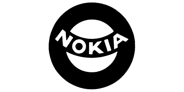
Nokia’s initial logo, which showcased the Salmon fish, was substituted with a new design in 1965. The fresh emblem took on a circular shape with a black background, and the word “Nokia” was prominently inscribed inside it in capital letters and white ink. However, this spherical Nokia logo had a short-lived existence, lasting only a year or two. This change was prompted by the merger of the three companies under the umbrella of Nokia Ab in 1967, and a new logo was introduced.
Read Also: Apple Logo – Meaning and History of Apple Emblem

Nokia Logo Evolution
In 1966, the Nokia Company introduced its “Arrows” emblem, which bore a striking resemblance to the current version. It featured a paler shade of blue and an illustration of an arrow, with the main difference being the typeface used. Despite the distinct typeface, the Nokia Arrows logo maintained a sense of continuity by representing the three arrows, symbolizing the amalgamation of different companies. Above all, the employment of a minimalist, bold sans-serif font emphasized attributes like “reliability” and “quality.”

In 1992, the logo underwent minor alterations, including the introduction of the “Connecting People” slogan, the removal of the three arrows, and the adoption of a darker shade of blue.

Nokia emblem history saw another change to Nokia emblem was made in 2006 when the slogan used the “Nokia Sans” typeface created by Erik Spiekermann. This new version also featured a progressively denser shade of blue color. Nokia stopped using the “Connecting People” slogan in 2011.
Nokia Font and Color
In 2011, the wordmark received a minor update with a new font introduced, known as “Nokia Pure,” designed by Dalton Maag. Nokia has been exploring different shades of blue since 1967, and the current one surpasses all previous choices in terms of vibrancy.

Nokia Text Logo
In the current logo, the brand name is presented in a straightforward Sans font, appearing bold. Unlike the typical oval or spherical shapes, the letter “O” takes the form of a rectangle with rounded corners. Additionally, the letter “K” resembles a mirror image of the familiar “play” button commonly seen on electronic devices.
During the 1990s, Nokia held a dominant position in the global market for mobile phones and smartphones. However, poor management decisions in the latter part of the 2000s had severe consequences, resulting in a rapid decline in Nokia’s market share for mobile phones.
In 2014, Microsoft acquired Nokia’s mobile phone division, leading to the launch of Microsoft Mobile as its replacement. Following this sale, Nokia shifted its focus towards the Telecom infrastructure business and IoT. It wasn’t until 2016 that Nokia reentered the mobile and smartphone industry through a licensing agreement with HMD Global. As of 2021, the Nokia Company stands as one of the top five network equipment manufacturers globally and remains a key patent licensor for many major mobile phone suppliers.


