The English fashion brand Burberry was established in 1856, and with a legacy spanning over a century, it has navigated through various business cycles. The Burberry logo meaning has played a significant role in this journey and has recently undergone an update. Initially, the company’s focus was on outdoor clothing, but it later transitioned into the realm of high fashion.
Table of Contents
| Burberry Group plc Information | |
| Founded | 1856 |
| Founder | Thomas Burberry |
| Headquarters | London, United Kingdom |
| Official website | www.burberryplc.com |
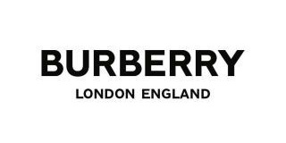
In August 2018, Burberry introduced a fresh logo and monogram, which was the creation of graphic designer Peter Saville. This new Burberry logo marked a new chapter for the brand under the leadership of Chief Creative Officer Riccardo Tisci. The updated Burberry emblem was notably radical, as it departed from the traditional “Equestrian Knight” and presented the brand name in a bolder and more contemporary font. The new minimalist Burberry logo featured the brand name in all capital letters, with “LONDON ENGLAND” appearing in smaller text beneath it. In a way, the brand embraced the trend of minimalistic design, a path also followed by brands like Louis Vuitton, Céline, Tom Ford, Fendi, and Chanel.

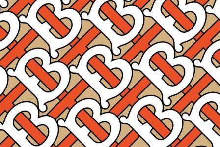
The creative team also introduced a pattern featuring interlocking Ts and Bs to create a “TB” monogram, drawing inspiration from the initials of the brand’s founder, Thomas Burberry. This monogram, set to be prominently featured in advertising, combined an eye-catching blend of orange honey, classic white, and the iconic Burberry beige. Remarkably, the monogram was the outcome of Tisci’s exploration of the Burberry archives and has roots dating back to 1908.

In a sense, the brand’s first venture into a significant design change in nearly 20 years represented a balanced approach. It involved parting ways with a globally recognized design element, the “Equestrian Knight,” while simultaneously reintroducing a historical element from the archives, the Monogram.
Burberry Logo Meaning – The Equestrian Knight
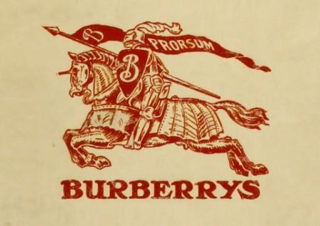
While the Burberry logo was founded in 1856, it wasn’t until 1901 that the Equestrian Knight made its debut in the company’s clothing range. The Burberry emblem was complemented by the Latin word “Prorsum,” signifying “forward.”

The Equestrian Knight symbolizes nobility and honor, while the shield conveys a sense of protection. This shield is a direct reference to the significant protection provided by the gabardine fabric against elements like snow and water. Thomas Burberry, the founder of Burberry, invented this waterproof fabric in 1879, and it proved to be a game-changing innovation compared to the prevailing Mackintosh raincoats of the time, which were heavy and restricted freedom of movement.
Read Also: Rolls-Royce Logo Meaning: How BMW Won Flying Lady From Volkswagen
To set its products apart from inexpensive imitations, Thomas Burberry registered the Equestrian Knight logo in 1909, even though it had initially appeared in 1901. While the Burberry logo and typeface saw minor modifications over the years, the Equestrian Knight retained its visual identity until it was discontinued in 2018.

