| Audi AG Information | |
| Founded | 16 July 1909 |
| Founder | August Horch |
| Headquarters | Ingolstadt, Germany |
| Official website | www.audi.com |
| Owner | Volkswagen AG |
| Other brands/JVs | Lamborghini Ducati |
| Slogan | Vorsprung durch Technik |
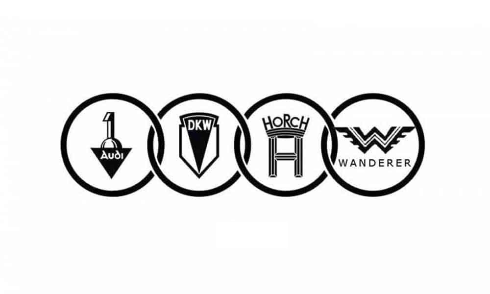
Audi’s present logo is a sophisticated one, featuring four interconnected rings. This emblem symbolizes the merger of four automakers, namely Audi, DKW, Horch, and Wanderer. Among these four, Audi and Horch brands have direct historical ties to August Horch.
Horch’s Troubled First Innings
The history and development of Audi have been a dramatic journey. After collaborating with Karl Benz for almost three years, August Horch ventured out to establish A. Horch & Cie. in Cologne in November 1899, alongside his business partner, Salli Herz. Over time, the company relocated to Zwickau, one of the prominent industrial hubs, in May 1904 and was renamed Horch & Cie. Motorwagenwerke AG.
Audi Logo Meaning: Latin translation of Horch
Differences among key officials, which seemed to be a common occurrence during that era (even Henry Ford faced internal struggles), led to a decision by August Horch to part ways with the company and embark on a fresh start. He naturally named his new venture “August Horch Automobilwerke GmbH.” However, this choice of name did not sit well with the management of his former company. Following a Supreme Court ruling that found the new name too similar to the previous one, Horch was compelled to come up with a different name for his new venture.

During a brainstorming session with his business associates Paul Fikentscher and his nephew Franz Fikentscher at the latter’s apartment, August Horch faced the challenge of renaming his company. As they deliberated, Franz’s son, who was studying Latin in the same room, noticed that the Latin word for “Horch” (which means “hear” or “listen”) is “Audiatur.” This brilliant insight led to the suggestion of naming the new company “Audi.” The idea was enthusiastically embraced by all, and consequently, the company was renamed “Audi Automobilwerke GmbH Zwickau” (and later renamed to “Audiwerke AG Zwickau” in 1915).
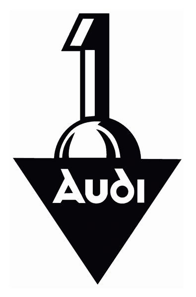
The early logo of the company was quite different from the one we are familiar with today. It featured the name “Audi” written inside a black inverted triangle with the number 1 positioned at the apex of an equilateral triangle. This numerical representation depicted a gearshift rising from behind. Notably, while the logo underwent significant changes over the years, the automaker retained, for an extended period, the way “Audi” was written, including the font used in the logo.
Audi Logo Meaning – Auto Union and the four-ring logo
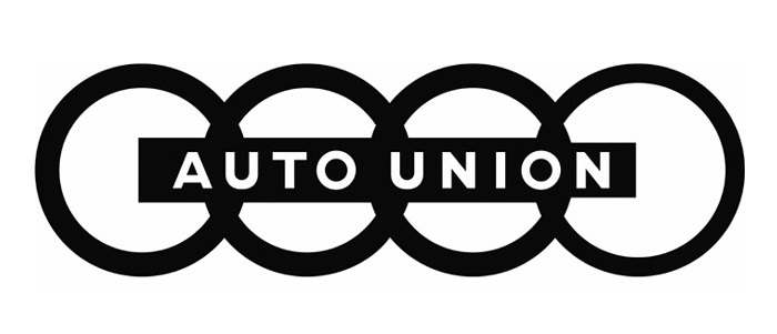
The four distinguished companies continued on their paths until they were united under the collective banner of Auto Union AG in 1932. This unification became possible due to the efforts of Danish industrialist Jørgen Rasmussen, who was the owner of DKW and had acquired a majority stake in Audiwerke AG in 1928. With the merger of the four companies and a concurrent challenging restructuring process overseen by the Saxony Regional Bank, which had made substantial investments in Rasmussen’s enterprises, Auto Union AG came into existence.
During this period, August Horch had withdrawn from the administration of Audi, although he retained a position on the board of trustees and also held a role on the board of Auto Union. It was at this time that the newly merged entity opted for the distinctive four interlocked circles in their logo, each circle containing the individual company logos inside, symbolizing the unity of the four original companies.
While the specific inspiration behind the concept of the interlinked circles is not clear, it can be reasonably inferred that the central theme of the logo was unity, equality, and cooperation. The emblem’s design, with the four rings interlocking, symbolizes the harmonious collaboration of the four original companies within Auto Union AG.

Court case – Audi copied the Olympics logo?
The resemblance between the Audi emblem and the Olympic rings led to a legal dispute in 1995 when the Olympic Committee took Audi to the International Trademark Court. Ultimately, the court’s decision favored Audi, and as a result, Audi was not required to make any changes to its emblem. This legal outcome affirmed the distinctiveness of the Audi logo, allowing it to maintain its iconic design.
The last version of the Audi symbol was created in 2009 to celebrate the centenary of the iconic automaker. Fortunately, there were no drastic alterations to the visual identity of the German brand, except for making the circles appear more interconnected. Chrome is widely utilized in automobiles, and Audi is no different, incorporating a generous amount of silver to give the logo a vibrant, contemporary, and refined appearance.

Throughout its eventful journey spanning over a century, Audi has witnessed numerous significant developments, including changes in ownership, from Daimler-Benz to Volkswagen. Some of these transitions, such as the shift from East to West Germany and the emission scandal, posed existential threats. However, Audi not only managed to survive these challenges but also flourished over the past century. Today, it stands among the prominent premium Original Equipment Manufacturers (OEMs), alongside Mercedes-Benz and BMW.

Very informative and interesting content to have perused yet again! Well done!