Mazda’s name has a unique origin, as it is derived from Ahura Mazda, the god associated with light, intelligence, and wisdom in ancient civilizations of West Asia. Interestingly, Ahura Mazda is also the name of the deity revered by Zoroastrians. The Mazda Logo meaning and history make it a distinctive and thought-provoking choice for an automotive brand. The company has indicated that the name might also be connected to the founder’s name, Jujiro Matsuda. This dual association with both a deity and the company’s founder adds depth and meaning to the Mazda name.
Table of Contents
Mazda Motor Corporation Information
| Founded | 30 January 1920 |
| Founder | Jujiro Matsuda |
| Headquarters | Hiroshima, Japan |
| Slogan | Zoom Zoom Forever |
| Official website | www.mazda.com |
Mazda was founded in 1920 under the name Toyo Cork Kogyo, later renamed Toyo Kogyo, but it operated without a logo for a significant 14 years. This may not seem unusual when considering that the company didn’t begin manufacturing anything resembling an automobile until 1931. Its initial ventures included cork production and diversification into machine tools before it eventually introduced a three-wheeled mini-truck, often referred to as an auto rickshaw.
Mazda Logo Meaning and History
Consequently, the need for a logo and a stylized Mazda brand name emerged in 1934, and they began to appear on the company’s vehicles. A more refined logo was introduced a couple of years later, featuring a pattern of three waves that formed the letter “M,” symbolizing “Mazda Motor Manufacturer.” The wave pattern also represented the flow of the river in Mazda’s hometown, Hiroshima, while the extended sides of the “M” represented wings, symbolizing agility, speed, and the ability to reach new heights.

Although the company’s vehicles carried the Mazda name, it wasn’t until 1984 that the company officially changed its name to Mazda. In the interim, in 1951, a new logo was registered for the Japanese market, which coincided with Tsuneji Matsuda taking over as president of the company.

In 1949, the company began exporting its three-wheelers and introduced a new logo specifically for overseas markets. This logo featured the simple “Mazda” written in Roman script, reflecting the company’s name in a format more accessible to international audiences. This move was part of Mazda’s efforts to expand its presence and reach global markets.

After taking the helm, Tsuneji Matsuda shifted Toyo Kogyo’s focus toward car production, but it took several years for this vision to materialize. In 1960, the brand’s first car, the R360 coupe, was launched. To mark this significant event, a stylized “m” in Roman script was adopted as Mazda’s emblem, signifying the company’s entry into the automotive industry.
Another change occurred in 1975 when the company introduced the monogram logo that is still present on its vehicles today.

Eternal Flame logo and similarity with Renault
Despite the use of the Mazda monogram for its logo, in 1991, the company adopted a diamond-like shape enclosed in a circle as its emblem. This design, often referred to as the “eternal flame” logo, also served as a tribute to the rotary engine, for which Mazda had gained recognition and acclaim.
The Mazda logo emblem was subsequently refined by smoothing out the edges of the diamond shape, as the previous design bore a resemblance to the Renault emblem. This modification helped to distinguish Mazda’s logo from that of Renault and gave it a more unique and recognizable identity.
Read Also: Did you know? Nissan emblem pays homage to Datsun
Current Mazda Logo Emblem: Not too old
Seven years later, Mazda introduced a new logo featuring V-shaped wings, which represented concepts of “growth” and “improvement.” These wings were enclosed within a dynamic circle, symbolizing the company’s readiness to expand and make progress in the 21st century. In Mazda’s own words:
Capturing the spirit of Mazda, the stylized “M” evokes an image of wings in flight and symbolizes the Mazda’s flight toward the future. The “V” in the centre of the “M” spreads out like an opening fan, representing the creativity, vitality, flexibility and passion that is Mazda.

In 2015, the Mazda logo underwent a refresh, which involved refining the colors and providing a three-dimensional treatment to the Mazda monogram.
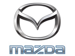
In 2018, another swift update was made to the Mazda logo, which involved the removal of the blue color from the script.
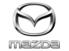
A noteworthy but often unnoticed detail in the Mazda monogram is that all the letters are in lowercase except for the letter “D,” which is in uppercase. Mazda’s official explanation for this choice is that it represents the automaker’s commitment to precision and reliability. Using a lowercase “d” would have caused it to extend above the upper line of the other letters, and the distinct styling of the “D” highlights Mazda’s dedication to detail and quality.
Mazda has displayed some inconsistency in its logo design over the years, but the current Mazda emblem has remained in use for over two decades. With its classy design elements and high recognizability, the current logo has established itself as a lasting and iconic symbol for the Japanese automaker.

Hi,
Mazda did a facelift of its logo in 2018. The corporate script isn’t blue anymore. Could you please update it on your website ?
You can find the latest version here :
https://upload.wikimedia.org/wikipedia/commons/7/77/Brand_Mark_Vertical_Primary_ver1.1.png
Many thanks in advance
Thanks Janna for dropping by and offering help. We’ve updated the content to reflect the latest change in Mazda logo