Mercedes-Benz serves as the passenger car division of Daimler AG, and its iconic three-pointed star logo is renowned not only for luxury passenger cars but also for its presence on trucks and buses. In this regard, the Mercedes-Benz logo meaning distinguishes it from its primary competitors, Audi and BMW. The company boasts the distinction of being the world’s oldest continuously produced automobile line, with its origins dating back to 1909. The Mercedes-Benz logo carries a significant connotation, representing the company’s aspiration for “domination of the land, the sea, and the air.” Here is more about the Mercedes-Benz logo.
Table of Contents
Mercedes-Benz Information
| Founded | 28 June 1926 |
| Founder | Karl Benz Gottlieb Daimler |
| Headquarters | Stuttgart, Germany |
| Slogan | The best or nothing |
| Official website | www.mercedes-benz.com |
| Owner | Daimler AG |

Mercedes-Benz logo meaning
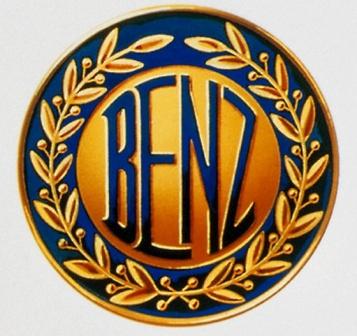
The Mercedes-Benz logo was created in 1926 when Daimler-Motoren-Gesellschaft (DMG) and Benz & Cie merged. Similar to the companies, the three-pointed star emblem is a combination of two logos. The precursor companies commenced their journeys in 1883 for Benz & Cie and 1890 for DMG. In 1909, Benz & Cie adopted a laurel wreath logo as its corporate identity, which featured the stylized word Benz enclosed within the laurel wreath.
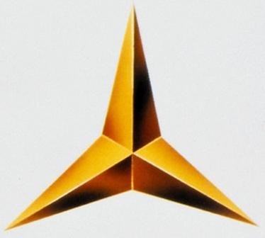
In the same year, DMG took a significant step by obtaining legal protection for a symbol that featured a three-pointed star, signifying a departure from the “Mercedes” lettering that had been previously used on its vehicles. The concept for this symbol was attributed to Paul and Adolf Daimler, the sons of the company’s founder, Gottlieb Daimler. Interestingly, Gottlieb had employed this symbol to mark the family’s residence on a postcard that depicted the town of Deutz during his time living there. This historical connection added a unique and meaningful dimension to the three-pointed star emblem.
The logo underwent further refinements in 1921 when DMG registered a distinctive star enclosed within a ring as its emblem. This logo featured not only the central prominent star but also four smaller stars within the circular band, forming a cohesive theme that complemented the central larger star and the “Mercedes” lettering. This design evolution brought more depth and symbolism to the emblem.

Merger leads to Mercedes-Benz logo
In 1926, the two companies, DMG and Benz & Cie, merged as the demand for automobiles in Germany sharply declined following World War I. This merger resulted in a unified logo that combined the three-pointed star from DMG with the laurel wreath from Benz & Cie. The wreath also featured the trade names of both Mercedes and Benz. Along with the unified logo, the company began using the trade name “Mercedes-Benz” for its cars, which served as a tribute to the founding fathers and honored the legacy of both companies.
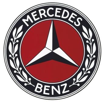
Over the subsequent years, there have been some minor cosmetic adjustments to the logo, with one of the most notable changes being the transformation of the laurel wreath into a more straightforward circle. The current Mercedes-Benz logo is characterized by its striking simplicity and is typically presented in silver and black colors. Due to its distinct appearance, the Mercedes-Benz emblem is often referred to as the “silver arrows,” and its meaning is directly connected to the earlier DMG logo, signifying the brand’s rich heritage and legacy.
Despite its extensive history, the Mercedes-Benz logo has remained largely consistent and retained its visual identity, similar to its competitor Audi. This continuity in logo design reflects the brand’s commitment to preserving its iconic and recognizable symbol throughout its long and storied history.

